The Perfect Chart
How small changes in presentation of data can dramatically improve product team execution.
As a product person, I spend a lot of time looking at metrics. Data is a critical mechanism for how to understand what's going in a product and track progress toward goals.
As well as the careful choice of metrics, the decisions we make in how to present data are also powerful levers for improving a product team’s performance.
Bad charts can cause confusion and, worse, apathy. But a well-designed chart can rally a team around a goal and encourage them to excel.
Over the years I've developed a few simple rules for how to make charts awesome. I've applied these again and again on product after product and they're highly effective in getting across maximum information, with minimum overhead.
Together these rules make up The Perfect Chart.
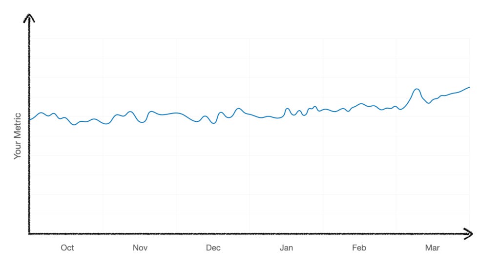
Let's start with the kind of thing people throw on a dashboard all the time.
OK, we have some sweet, sweet data. But how do we interpret this? The metric is gently wiggling around with no spikes (that's probably good).
Let's assume this metric represents our team's primary KPI. OK, but what's the target for this metric? What's the goal? Rather than having to look elsewhere (like a roadmap doc), wouldn't it be better if we just displayed the goal on the chart? Of course it would:
Yay! OK, great. This dotted orange line represents our numerical goal. (I personally prefer metrics in blue and goal lines in orange -- it's what Meta's internal tools default to and I've got used to it).
But the x-axis of this chart ends on the most recent data point: today. Let's assume we want to get the wiggly blue line above the dotted orange line (more on that assumption later), how long have we got left to achieve that objective? Were we supposed to hit that goal last week? Or have we got more time? It's unclear.
Good news, we can make it clearer just by extending the X-axis out to the end of the reporting period like so:
Sweet. Turns out, this team plans in half-yearly cycles, so by extending the x-axis out to the end of June, we can see we've got three months left to hit the goal -- no need to panic (yet).
But there's still many questions this chart doesn't answer:
When did we set this goal? Is it something we've been working on since the start of the half or longer? Are we 50% of the way through our goaling period, or 75% of the way through?
Is the team on track to his the goal or not? Will we be successful if we keep doing what we're doing or do we need to change things up? You can kinda squint and see the trend, but two people might see that differently.
Is the aim to get the blue line above the dotted orange line, or is it to keep it below it? (Not everything is supposed to go up and to the right -- perhaps this is fraud rate, and the aim it to keep it under control).
We can make the chart answer all of these questions with one simple change: lets make the goal line start on the value of the metric at the start of the half, and end at the target we're aiming to hit at the end of the half:
Would you look at that - It's a thing of beauty. We can now see that:
We set this goal at the start of the half.
The aim is to increase the metric, not decrease it.
We have three months left to hit it.
and crucially...
That we're not on track to hit it!
This is the kind of view that suddenly makes a team realise that that might need to change things up. Perhaps we have the next big thing up our sleeve that'll bend the curve. Perhaps we don't.
I find this view to be extremely motivating for a team. It's suddenly extremely clear that we want to be ABOVE the orange line, not below it - and that we're not on track. Everyone can see the problem, and it forces the right conversations: are we OK with where we are? What needs to change? How do we get back on track?
But this chart could still be better. While the x-axis is now pushed out to the end of the half, we're only seeing 3 months of historical data. It makes it hard to see if the team's efforts this half are significant given the historical baseline.
Solve: pull back the x-axis to include data from the full previous half:
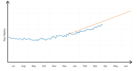
Boom. There we have it The Perfect Chart! This chart contains SO MUCH more information that the first version. We can see where we started, where we're going and where we came from.
We can now see that this metric was declining, and the team's efforts are bending the curve upward towards an ambitious new target. It's not essential data, but it's useful context that can help a team understand the relative impact of their work.
So here are those 3 simple rules for the perfect chart:
Push your x-axis out to the end of the reporting period - not the date of your most recent data point.
Plot a goal line, and ensure your goal line starts at the right date and value for when the goal was set, and ends at your target date and value.
Pull your x-axis back to show the entire previous reporting period.
Bonus round: Guardrails and counter-metrics
Earlier I mentioned that not all charts are supposed to go up and to the right. It's common for teams to take counter-metrics or guardrails -- parameters you must stay within while you attempt to hit your goal.
Take this example:
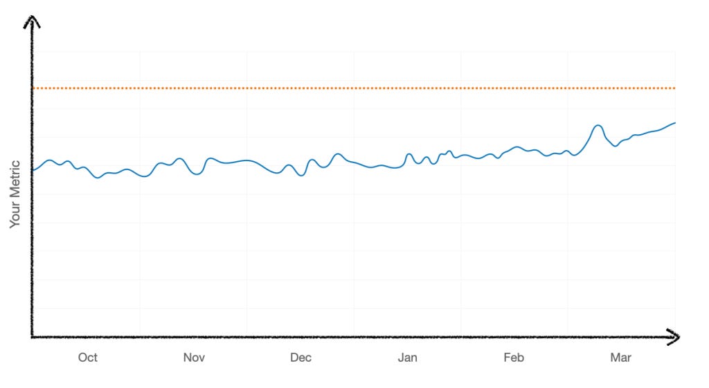
Again, without additional context, it's hard to know what this means. Is this good? Bad? OK?
Lets add in a goal line:
Let’s assume the chart title tells us this is a guardrail metric which probably means we need the blue line to stay below the orange line.
But the blue line is trending upward. Should we be worried? Should we panic?
I've seen a lot of charts like this -- we're trending toward the guardrail (bad), but we're still below it (good). One person on the team might look at this and thing "no problem" but another might start to freak out. Who is right?
In these situations, it's best to agree on what the difference between A'OK, mild peril, and total disaster.
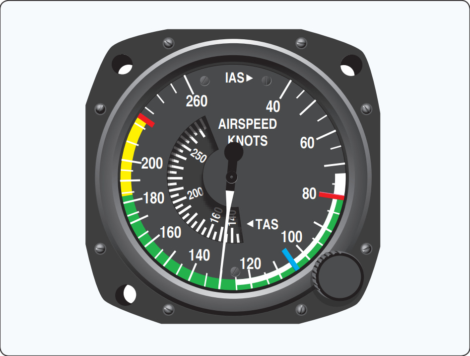
One industry that does this really well is... aviation.
This is an airspeed indicator - and it clearly shows a green area (all good), an amber area (maybe start to worry) and red (don't go here)!
We can apply this same principle to our guardrail metric chart:
Uh oh! We're above the orange line!
This allows you to define a playbook for what to do and when.
For example, if you cross the red line, you have to file a SEV and drop everything to get it back down. And if you cross the amber, you perhaps open an investigation into what's going on.
What's great about this is that it's extremely clear what's not OK (crossing the red line) and when we should start as a team to react to an upward trend (crossing the amber line).
An alternative way to represent this which I think is even better is to take inspiration from the airspeed indicator:
So there you have it - another form of chart that makes is super clear what's going on - and allows everyone in the team to have the same understanding.
Key takeaway: just a few small changes to how you present data and goal metrics can have a huge impact on your teams and how they execute.


