Conference Talk: Extreme Clarity Tips
What is is, why it matters, and how to practice it.
The post below is a version of a talk I gave at Product at Heart in Hamburg in June 2023. It was a great event, and the hosts Petra Wille (author of Strong Product People) and Arne Kittler couldn’t have been better hosts. If you’re based in Europe, this should be on your list of events to attend.
The last two talks about clarity in thinking and execution were great, and I want to continue that thread by talking about clarity in communication.
Because it turns our that when your working at scale, at speed, or when the stakes are high, it really matters.
I wanted to illustrate this by telling the story of a product. An unusual product, but a product nonetheless.
This is the Mars Climate Orbiter. It was built by NASA’s JPL in the mid-90s. It was a $330 million dollar program, and the goal was to monitor the weather, temperature and water distribution on the surface of Mars.
Hundreds if not thousands of people worked on this project. They built it, tested it, and on December 11th 1998 they launched it into space.
And then they waited.
It took 286 long days for the spacecraft to travel to Mars.
Finally, they took their seats in the control room to watch as it was due to perform a critical engine burn and enter orbit around another world.
This was all pre-programmed — it takes more than 5 minutes for a radio signal from Earth to reach Mars so you can’t “fly” a spacecraft remotely — you just have to sit and watch, hoping your calculations were correct.
To horror, the signal from the spacecraft vanished from their screens.
Poof, gone.
They scrambled to figure out if they could re-establish communication, but to no avail. Their $330m spacecraft was lost.
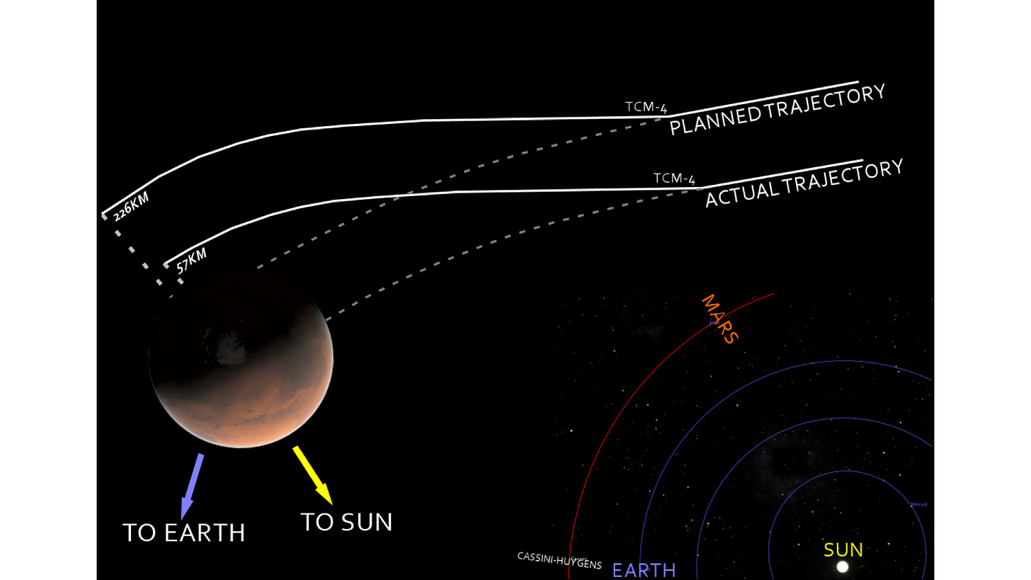
As you might expect for something that expensive, there was an investigation to find out what had gone wrong. What they discovered was that there had been an error in the navigation system. When the Mars Climate Orbiter approached Mars, it was way too close to the planet. Instead of going into orbit, it had either burnt up in the atmosphere, or bounced off into deep space.
What was the root cause of this error?
While the bulk of the probe was built by NASA, some key parts were built by a contractor, Lockheed Martin. While NASA worked in Metric, Lockheed assumed they’d be working in Imperial.
NASA, to their credit, were clear: this wasn’t Lockheed’s mistake alone — it was a systemic breakdown in communication.
This is a pretty clear example of how errors in communication - not being extremely clear - can lead to pretty significant problems with projects.
So lets define what we mean by extreme clarity:
Communicating something in a way that leaves
no ambiguity in the mind of the reader such that
they all leave with the same understanding.
But my old boss put it even more succinctly:
“Assumption is the mother of all fuckups”
So today, I wanted to spend some time looking at a few situations that we as PMs often find ourselves in, where clarity matters most, and where I see people often fall short:
Data - particularly percentages.
Setting Goals - especially metrics-based goals.
Making decisions.
Lets take each in turn
1/ Data
Here’s a line from a recent report from one my teams:
Immediately, a question in my head: from what to what? So I asked for clarification.
They came back — 13% to 23% —— but that’s not 10%, it’s 10 percentage points!
This increase is actually a 77% percent increase, not a 10% increase.
That is a HUGE difference in perceived impact — and differences like that could result in very bad decisions being made - just because of a misunderstanding in communication.
The solution is simple. When you’re communicating changes in metrics — include not only the percentage (or percentage point) change, but also the FROM and TO numbers.
2/ Goal setting
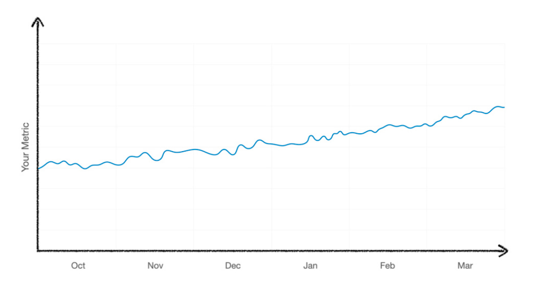
I recently asked one of my teams for their dashboard, this is what they sent me.
Yay, we have data, but this doesn’t tell me a lot.
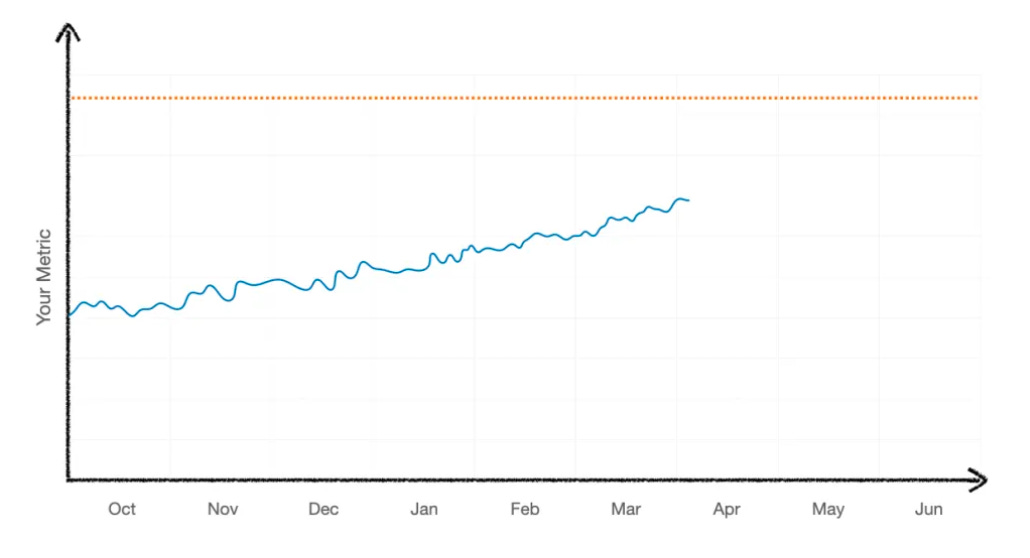
I wrote back: but what is your GOAL for this metric? - can’t we get that on the chart? Here’s what they sent back:
Sure, that’s better, but it’s still ambiguous:
is the goal to get ABOVE this line, or STAY BELOW it?
when do they need to hit this goal by — how long have they got left?
when did they START?
Not at all clear.
The first change was I asked them to extend the X axis out to the end of the half — which is when they needed to hit this goal.
OK, this is better — we can see they’re trending towards the line — but are they on track?
So next, I asked them to change the dotted orange line to meet the metric at the START of the half.
Now you can see…
1/ when they started working on this
2/ where they’re trying to get to
3/ WHEN they’re trying to get to it
And — critically - that they’re behind where they need to be to hit the goal. This allow you to start having the right conversations — how can we help you get back on track NO AMBIGUITY — IT”S EXTREMELY CLEAR
But what about Guardrail metrics where you need to stay BELOW some number?
In those cases, charts like this are not that bad — there’s no start or end, you’ve just gotta stay below. BUT how far below. Should the team act only if they cross the line, or do they need to start working as they approach the line? When? AMBIGUITY! — NOT EXTREMELY CLEAR
One industry that does this really well is aviation….
Here’s an altimeter. It’s a work of art.
Green — everything is fine
Amber — start to panic and take evasive action
Red — don’t go here.
Its so clear.
We can apply this same idea to our goal chart. Lets add in an orange line and a red line. Now we can see that the team is trending towards red (BAD) and we have cross the orange threshold at which they start needing to do work to bring it down.
Even better, make them solid.
And boom - NO AMBIGUITY — EXTREMELY CLEAR!
3/ Making Decisions
Making decisions is super hard. That’s because it’s complicated.
Before
What are the options?
What factors are being considered?
What are the tradeoffs?
During
What are the different team’s recommendations?
Who’s actually making the decision?
After
Who made the decision and when?
What factors were considered?
So I wanted to share the best decision-making framework I’ve ever used.
It’s not mine - it’s Guy Rosen’s, but its helped me in everything from reviews with Mark Zuckerberg, down to where our team’s offsite should be.
For this example, I’m going to use something that’s on everyone’s mind right now — possibly the most important decision of the day…
What am I going to have for lunch?
All we need is a single slide and a table:
First, lets list out the options. You would be AMAZED at how valuable that is in and of itself. I often find someone says “actually there’s a 4th way” that had not previously been considered before.
Next - list out the EQUITIES — the factors we’re going to use in making this decision. Again, it’s amazing how many times this teases out a misalignment of what’s important - or that there’s a factor that wasn’t being considered.
In this case, I’m going with cost, healthiness, taste, and… regret.
Now we just fill in the cells — colouring them red, amber, or green based on how they rank against these equities. A cheeseburger is clearly best on taste, but it’s not great on the other dimensions!
A salad, by contrast, ranks highly in some areas, but relative to a cheeseburger, it’s not something I’m gonna write home about.
And a sandwich is somewhere in the middle.
Now this — relative to many decision-making processes I’ve seen is a huge step forward. The act of creating this table teases out the vast majority of the disagreements between parties. People end up arguing about whether a cell is really amber or green.
Some people might think this is petty disagreement, but you know what, it’s not. This is the decision-making process. Decisions often don’t stick because people didn’t feel heard, that their opinions were not considered, that their ideas were not debated. This framework is great on it’s own, but it’s the process by which you fill it in that’s the most valuable part.
Ok so how to actually make the decision? Normally its a MEETING!
But going into the meeting, it’s useful to know where the different parties stand — so lets capture that on the slide….
Again, this is adding even more clarity. Instead of spending the first 15 minutes of the meeting dancing around the question of who things what, everyone knows where everyone else stands, and we can skip to the most important part: the debate.
Now hopefully - in this meeting, we’ll make a DECISION!
So we can add something which captures what we chose, and when it was decided.
Of course, it was the SALAD!
You would NOT BELIEVE HOW VALUABLE IT IS to have a record like this. Someone joins your team and is like “why the hell do we do it that way” — you can be like “Well - here’s the traffic light we used to make the decision.
Summary
So we talked what extreme clarity is, and why it matters.
And looked at three areas in which clarity is often lacking, and ways to improve it.
So here’s the key takeaways:
Know the difference between % and pp. Include the before & after numbers as well as the % (or pp) change.
Put goal lines on your charts.
Try out the traffic light framework for decision-making.
I hope you found this interesting, and hopefully you picked up one or two ideas you could use in your daily work, starting tomorrow.


