Bit of a different post to my usual fayre, but it’s a Friday, and product people appreciate great design — and the product I want to talk about today is not only a design classic in general, but has a few details which exemplify thorough, thoughtful design thinking.
Today, I want to dive into the design details of the Beosound 9000.
What the hell are you talking about?
The Beosound 9000 is a CD player made by Bang & Olufsen, a Danish manufacturer of high end audio and video gear. They have a long history of making unusual and distinctive products — and this is one of their most recognisable. It’s been called “the most iconic music system ever designed”.
It was designed by Dave Lewis, launched in 1996 (peak CD) and made for 16 years until production ended in 2011.
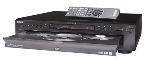
In world where most CD changers looked like this…
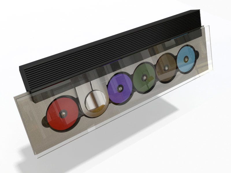
…the Beosound 9000 certainly stood out….
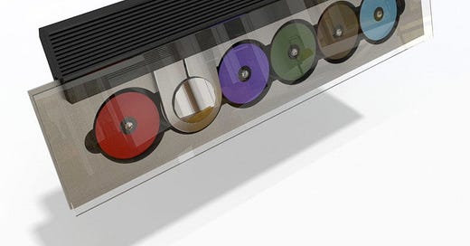
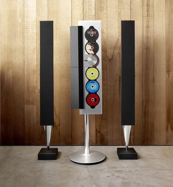
Unusually, it could be vertically or horizontally wall mounted, stand mounted or placed on a flat surface. Unlike most hi-fi which hides away the gubbins, the Beosound 9000 takes the CD changer mechanism and puts it front and centre.
This is clearly a confident piece of design all-up, but it’s in the details that the quality of the design thinking really shows through.
I wanted to highlight three things that
What I love about these is that none of them are “features” — things you’d market to the user to get them to buy your product — no, they’re just details that, if they were not there, would make the 9000 less, awesome. These details are in the background
Here’s three examples.
1: The discs always finish playing the right way up
The 9000 makes a point of putting your CDs on show - especially if you’ve hung it on the wall or a stand. Part of the product’s appeal is that it’s a way for the owner to make a statement: “these are my favourite albums” or “here’s what I’m listening to at the moment”.
But most CD labels have an orientation — they’re meant to be read one way up — and I can attest that when you load in a disc, it’s natural to place it to be read through the glass.
But a CD player has to spin CDs to play them — and wouldn’t it look messy if, after being played, they ended up arbitrarily rotated?
Whelp: the designers thought of that!
When the Beosound 9000 picks up a CD, it remembers the orientation it was it, and returns it to that orientation after playing. Check it out….
Let’s see that again close up:
That’s really not very easy to do. It took more than strong design thinking - that took engineering work, and likely required specialist components that increased the cost of the device. I don’t know of any other CD player that needs to remember which way to put back a disc. But this one does.
2: The rotatable logo
As I mentioned above, the 9000 can be placed on a table top, or hung on the wall. If hung on the wall, it could be mounted vertically or horizontally.
The B&O logo only appears in once place (typically understated) on the 9000, the CD player head. But the orientation of the logo would depend on how you’d mounted your device, and that might look a bit funny, mightn’t it?
Whelp, the designers thought of that!
The circular surface on which the logo sits it rotatable. You can turn it to match the orientation of your 9000 so the words “BANG & OLUFSEN” are always the right way up.
Tiny detail, utter class.
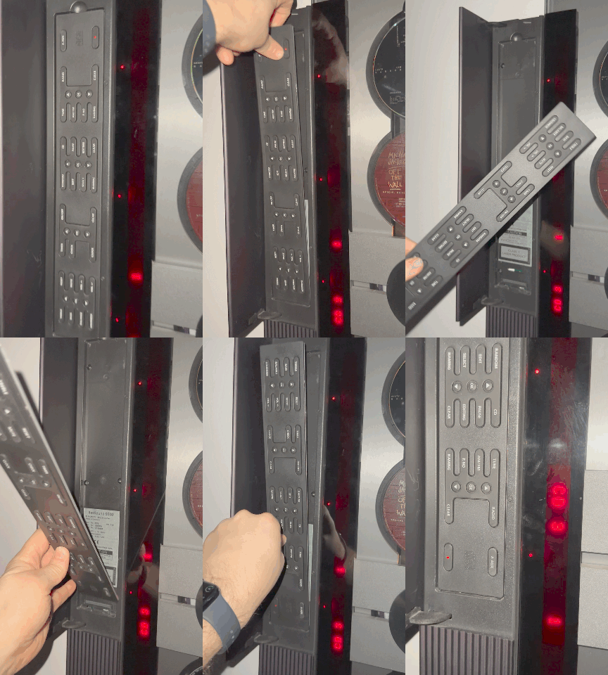
3: The rotatable control panel & display
The 9000 has a control panel hidden under a flap so those unsightly buttons don’t ruin the sleek lines of the device.
But like the logo and CDs above, these buttons have orientation. And the 9000 was designed to be mounted all kinds of different ways. It’s suck if the buttons were the wrong way up right?
Whelp, the designers thought of that!
The control panel is reversible — not “you’ll need a screwdriver to do that, mate” reversible, you can just lift the whole panel off it’s magnetic mounting, turn it round, and put it back in. While the device is turned on.
And what’s more — and this is genius — when the 9000 detects you’ve turned the control panel around, the dot matrix display also flips 180 degrees so its orientation matches that of the buttons.
Check it out:
Again, this is super not-easy to do. The control panel needs a special connector, and the circuitry needs to handle the buttons being ‘hot-swappable’ — which would have required work (and additional components) in the engineering stage.
I’m sure there were arguments about this. Is it really needed? What is the impact? How do we know how many people will need this feature? But on this product, and at this company, I doubt this was a data-driven decision. This was about intuition, craft, and conviction. Perhaps they did some users testing — I’d love to know.
Summary
Was the Beosound 9000 a “successful product”?
I think so. It was manufactured for 16 years across three versions. And here I am three decades after it was designed writing a blog post about it. It was never designed as a mass-market product. It was and is expensive.
But part of the reason people paid so much for it was not only because of the statement design, but because this was an object so thoroughly thought out.
There are great products which are cheaper, and more widely adopted — but these surprising design details are what give the Beosound 9000 a place in my heart (and, now, in my home!).






I love spotting B&O pieces in movies or seeing the Beolab in Friends. I’ve had a BeoCenter 9300 for ten years and one of my favorite things is turning it one by touching the glass and seeing the soft red glowing buttons underneath.
I’m trying to imagine what the equivalent “ CD will return to its original orientation” feature would be at Meta and if it would be anywhere in a roadmap. Highly doubt it since Meta isn’t a high end social media platform, but a fun thought.
Wonderful article! I remember marveling at the BESOUND at the B&O showroom, dreaming of purchasing. There was nothing comparable on the market. Way out of my league at the time.